Zahradní centrum DIKÉ
- UI/UX design
- Testing
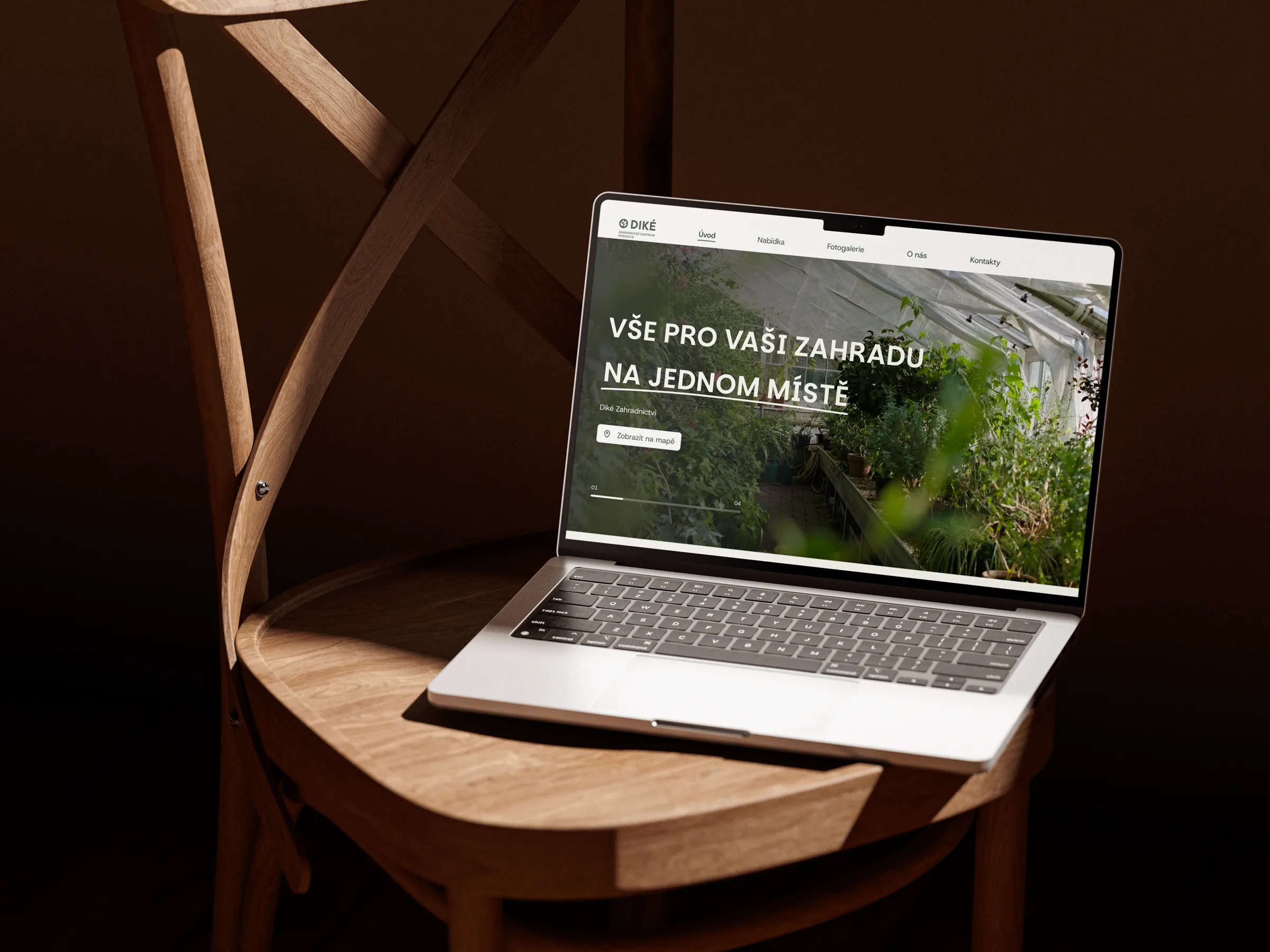
A new website for a garden centre in Příšovice. We turned a site that didn’t work on mobile into a clear, welcoming place for customers.
A garden full of plants, a website full of chaos.
DIKÉ is a large garden centre with a wide range of plants, soils and garden supplies. Their website, however, barely worked on mobile, and that’s exactly where people open it most, when they’re checking opening hours or directions before a weekend shopping trip. The offer was disorganised, the look was dated and the centre had nowhere to share events, guides or news.
Customers first, looks second.
Filip and I were the two designers on the project, joined by a developer and a graphic designer who drew the new logo. Besides design, I was in charge of client communication, project management and testing. We started with what people actually look for on the website, and only then moved on to the look: fresh, natural, with big photos and good contrast.
-
Analysis
The key customer journeys: where we are, when we’re open and what we sell.
-
Design
A fresh, natural look, quality photos and the new logo in one coherent whole.
-
Mobile
Opening hours, directions and phone always one tap away.
-
Testing
Ongoing testing with the client and a smooth handover to development.
Everything that matters, one tap away.
Above all, the website answers the two questions customers ask most often:
“Are you open? And how do I get there?”
Right on the homepage it shows whether the centre is open at the moment and, with one tap, navigates you straight to the garden centre. The website also includes an about section and a photo gallery of the whole garden centre.
The new logo gave the website a coherent, professional and modern look that reflects the real experience of visiting the centre.